GPS data from cars shows cycling potential
Every year, Danish municipalities make major cycling infrastructure investment decisions with the aim of persuading more people to swap the car for the bicycle. Here, a solid foundation of data is crucial to targeting investment where it will add most value. In this context, GPS data from car travel can be used to calculate and map out where the greatest cycling potential lies.
By Majken Kobbelgaard Andersen, COWI
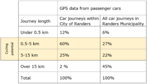
- Table 1: Breakdown of car journeys by journey length range according to GPS data. Journeys in the ranges 0.5-5 km and 5-15 km are regarded as being potentially cyclable or e-cyclable, respectively.
Various companies are continually collecting detailed car journey information on a daily basis from a representative sample of Danish passenger cars. The large quantities of data enable analyses that can answer many questions about car journey lengths, travel patterns and behaviour when we move around, be it at national, regional or municipal level.
From a cycling point of view, data from cars is of considerable interest in the debate on how big a potential there is for switching motorists over to the bicycle, and where that potential lies. On the basis of this data, several Danish municipalities have therefore mapped short car journeys that are, judging by the length of the journey, potentially cyclable.
The calculation and mapping of short car journeys can be used to:
› identify stretches of road/areas/destinations with high cycling potential;
› target e.g. campaign efforts on a particular geographical area;
› prioritise between cycling initiatives;
› set strategic, measurable KPIs for cycling promotion;
› evaluate actions over time (change in the proportion of short car journeys).
Big potential in Randers
An analysis of cycling potential in Randers Municipality shows that 49% of all car journeys in the municipality could potentially be made by bike or e-bike. Looking solely at car journeys within the City of Randers, as many as 85% of car journeys could, to judge by their length, be made by bike or e-bike.
Making the data analysable
The mapping is based on the potential for switching shorter car journeys to the bicycle, going by a simple consideration of car journey lengths. The changeover from car to ordinary bike is considered to be biggest in respect of journeys of between 0.5 and 5 km. For e-bikes, the potential is considered greatest in respect of journeys of up to 15 km.
A lower boundary of 0.5 km should be chosen, because these car journeys will probably not be transferable to the bicycle. They will typically be journeys made purely in order to move the car (e.g. if it is blocking another vehicle).
To ensure the quality of journey data, a number of filtering and data cleansing operations must be carried out so that the journeys included in the mapping are of adequate quality. For example, data from vans should be filtered out, as should short car journeys occurring chronologically before/after a long journey.
Presentation of results
The results of the analysis are typically presented in a series of overview tables and visualised in GIS maps or on a dashboard. The tables may show the total numbers of car journeys in the dataset broken down by journey length so as to illustrate the proportion of all car journeys in the municipality that could potentially be made by bike or e-bike (see example, Table 1). Among other things, these figures can be used to track how the proportion of short car journeys changes over time, or to communicate more strategically regarding the potential impact of investing in cycling promotion.
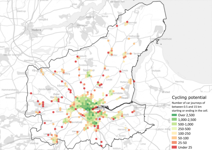
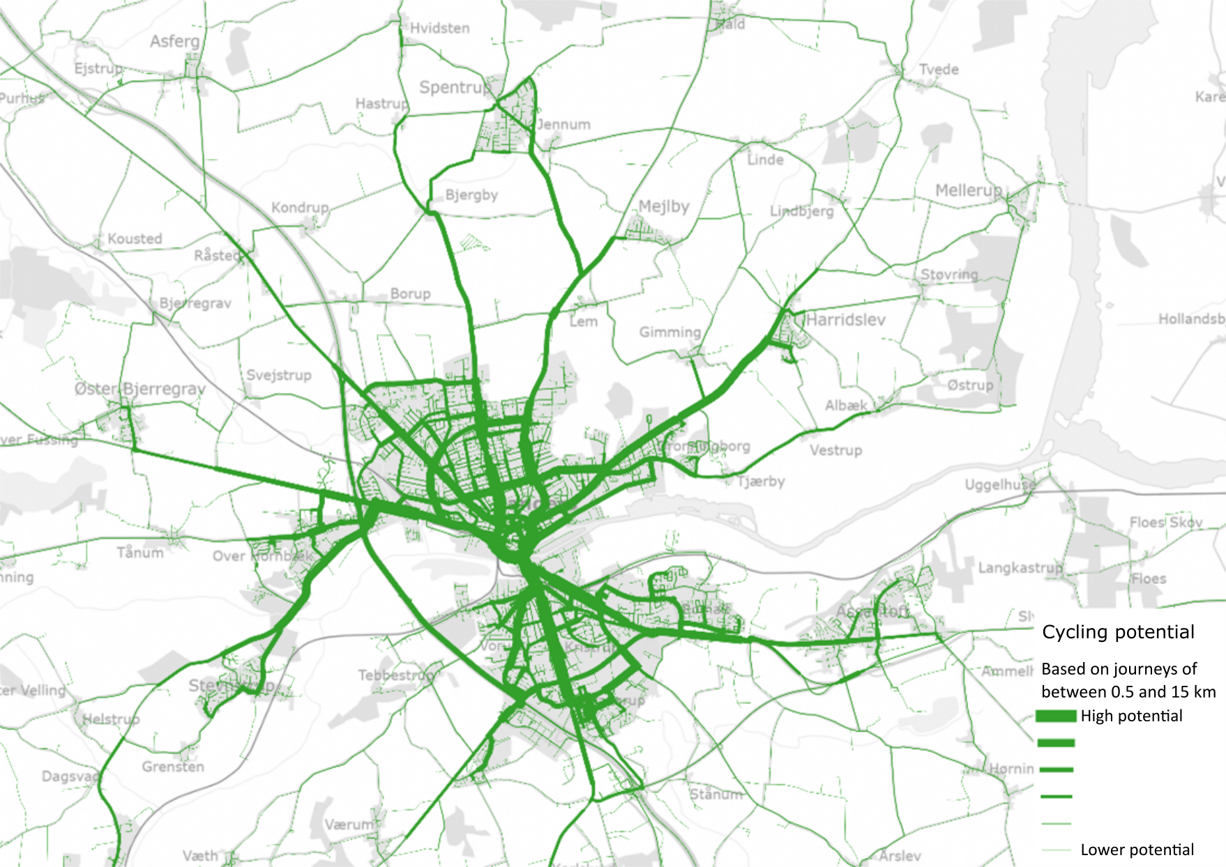
Visualisation of the results by means of maps makes it possible to geographically identify the stretches of road on which many short car journeys are being made, or the start and end points of those journeys (see examples, Figures 1 and 2). Comparing this with the existing cycling infrastructure, it is interesting to see whether stretches with shortcomings in cycling infrastructure (e.g. missing links) coincide with the number of short car journeys.
The results of an analysis carried out in Randers Municipality are shown below as an example.
- Figure 1: Example of mapping of cycling potential in Randers City (car journeys of 0.5-15 km). The cycling potential is shown as the number of journeys overlaid on the road network.
- Figure 2 : Example of mapping of cycling potential in Randers Municipality (car journeys of 0.5-15 km). The cycling potential is shown as the number of car journeys starting or ending within the cell.


